We have been working on value block-ins. The lightest values are painted in orange. The medium values are green/red mix, and the darkest have ultramarine blue mixed into that.
One of the homeworks that I assigned myself was this frog.
I used a picture from an advertisement in Popular Photography.
I blocked it in with the leaf near the frog's feet, his face, and his feet orange. The darkest hue was the almost black (actually a deep mix of ultramarine and the red-orange color).
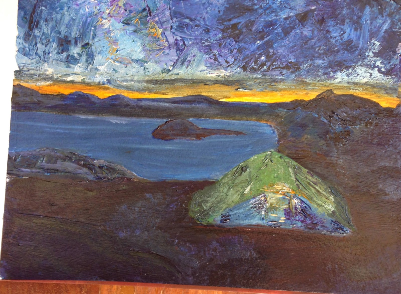
For class this week, I've decided to flip it. I picked a photo from Backpacker magazine that was a night scene. In this case, most of the ground was the darkest value. The sky was medium, and the tent and sunset was the lightest.
It is a pretty poor photograph because the darks are so dark, I needed a lot of light to take the picture.
I textured the sky and tent with a palette knife and some heavy gel medium. Now, I'm not done, but I haven't decided what to do next. I am not completely happy with the dark ground. (Maybe I'm getting texture-happy.)
Once I'm finished, I plan to flick some stars in the sky and some dirt on with a toothbrush.
FYI, before I began this painting I was searching for info on night scenes. Van Gogh painted a lot of night scenes. I found this great site that talks about the colors he used. So, although he was more yellow/blue, I went for a more classical orange/blue palette. The green is stretching the palette a bit, but it was a color I didn't want to give up, and I think it lends more interest than a blue tent might have.


No comments:
Post a Comment