Showing posts with label underpainting. Show all posts

Tuesday, April 28, 2015

More of England


After I quit painting my wild and crazy version of Cambridge, I decided to go wild with brushwork but stay truer to color with a painting of Windsor Castle. The goal was to show a soft view of the castle but not too fairy-tale. It is 8x12, and I ran out of time in class, so this is what one hour produced:
I under painted each block of color in its complementary color. So the castle was a yellow, the front tree was purple, and the green tree was red. My overall color scheme would be considered purple/yellow although it almost goes purple, green, orange.

Friday, October 31, 2014

Keep the Light...and the Dark

We have been working on value block-ins. The lightest values are painted in orange. The medium values are green/red mix, and the darkest have ultramarine blue mixed into that.

One of the homeworks that I assigned myself was this frog.
I used a picture from an advertisement in Popular Photography.
I blocked it in with the leaf near the frog's feet, his face, and his feet orange. The darkest hue was the almost black (actually a deep mix of ultramarine and the red-orange color).

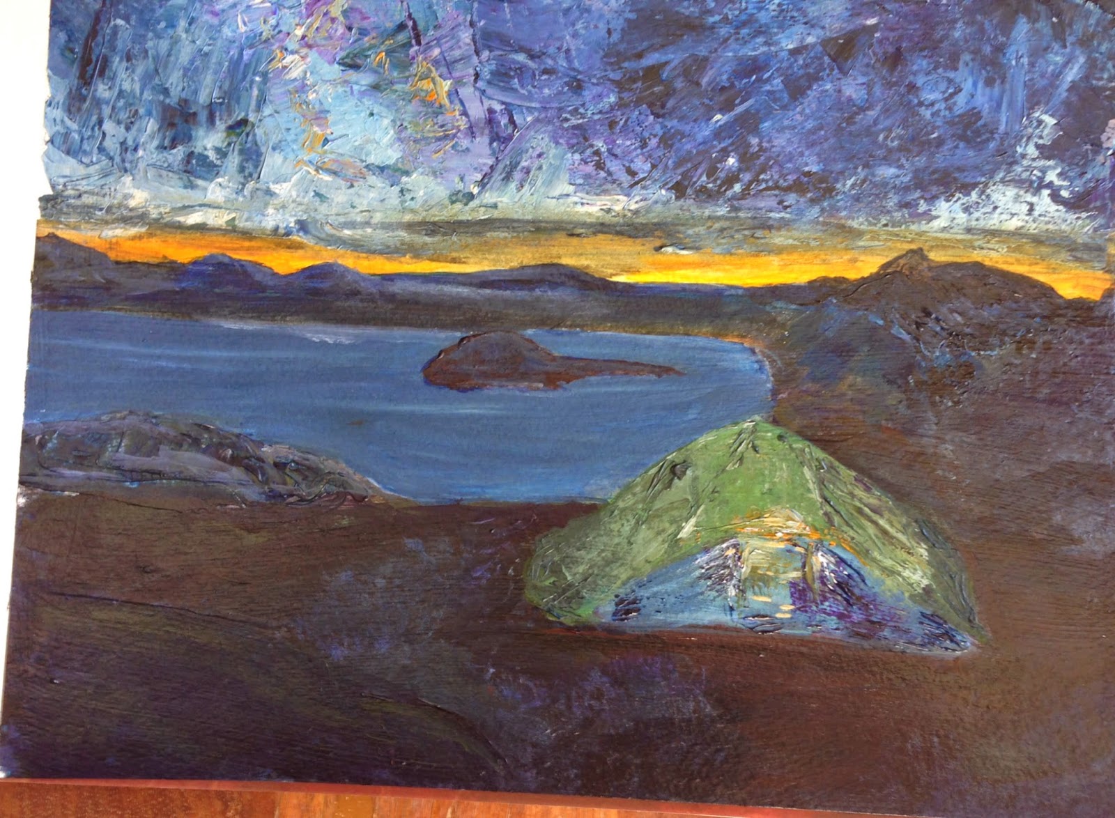
For class this week, I've decided to flip it. I picked a photo from Backpacker magazine that was a night scene. In this case, most of the ground was the darkest value. The sky was medium, and the tent and sunset was the lightest.
It is a pretty poor photograph because the darks are so dark, I needed a lot of light to take the picture.

I textured the sky and tent with a palette knife and some heavy gel medium. Now, I'm not done, but I haven't decided what to do next. I am not completely happy with the dark ground. (Maybe I'm getting texture-happy.)

Once I'm finished, I plan to flick some stars in the sky and some dirt on with a toothbrush.

FYI, before I began this painting I was searching for info on night scenes. Van Gogh painted a lot of night scenes. I found this great site that talks about the colors he used. So, although he was more yellow/blue, I went for a more classical orange/blue palette. The green is stretching the palette a bit, but it was a color I didn't want to give up, and I think it lends more interest than a blue tent might have.

Tuesday, October 28, 2014

Back to the Beach

This week, I took a break from painting people and fabrics to go back to my love of landscapes of the water.

I used the technique of blocking in color with lights, mediums, and darks first. The darks (the sky & blue houses) are colored with a wash of crimson, green, and ultramarine blue. The mediums with just crimson and green. The lights are bright orange.

The bright orange is what is responsible for this really lovely sky. My peers came up to me as I was painting and told me to just "Stop". They loved the moody sky.


I also removed the stilts that the houses were sitting on and some people from the background. My teacher and I thought the stilts would complicate the picture and pull emphasis in where we didn't want it.

I also began, at home, a picture I want to put up on my wall. It is based on two pictures I found. One has a bike that looks like one I own, only it had flowers in the basic. Another had a bike that I didn't like but the water was in the background. Both are similar to a pillow I own, so I thought I'd make my own version.
As you can see, I have the darks of the sea and grass laid in. I also have the brights of the basket and tires. My next step will be working on sand and then the grassy-to-be-fenced area.

My husband saw this and didn't understand that this was just the beginning. He said that the bike should be a little brighter. :-)