Tuesday, April 28, 2015

More of England


After I quit painting my wild and crazy version of Cambridge, I decided to go wild with brushwork but stay truer to color with a painting of Windsor Castle. The goal was to show a soft view of the castle but not too fairy-tale. It is 8x12, and I ran out of time in class, so this is what one hour produced:
I under painted each block of color in its complementary color. So the castle was a yellow, the front tree was purple, and the green tree was red. My overall color scheme would be considered purple/yellow although it almost goes purple, green, orange.

Sometimes It Just Doesn't Work

I was working on the painting of the canal that I posted earlier, but despite help from my teacher, it is one of my fails.


There are a lot of things that worked for it: the composition led the eye pleasantly, the colors provided  movement and contrast, and there were a lot of areas of complementary color. I also think the brushwork to the right of the paining was pretty good. But there was a lot that just didn't work for me. I could have kept working it, but I gave myself permission to give up. Maybe one day I will go back and start over with looser brushwork.

I have to admit it was fun to colorize Cambridge, UK! There was not a day of good sunshine when I visited, so if I want color, I have to invent it.


Monday, April 27, 2015

Impressionist...Maybe

In my last post, I talked about how I tend to consider my art impressionist or realistic abstract. But I'm not following any rules of a style (there is enough struggle with rules of composition, value, color, etc.). So I'd probably name the two seascapes below as realistic abstract and the following as impressionist (because I tend to get the "Oh, it looks much better from a distance" comment on these). 


 How do you classify these or your own art styles?

Impressionism...Color

When asked what kind of art I like, I usually say impressionist, or as time goes on realistic abstract. Both to me mean that the art will be something recognizable, but not realistic. Painting, to me, is an opportunity to edit the colors to create the feeling of the place because I often find that photographs are much duller than the feelings of happiness or beauty that I feel at the time.

That works sometimes, but sometimes that it difficult to do. I sometimes have trouble seeing the possibilities, so I decided to use Photoshop to colorize the photo I'm working from and SEE the underlying colors.
This photo was taken in Cambridge, UK, so you know that the colors were nothing like this! But I've found it helps me see the undertones. It also helps me see the color of the light.


Saturday, March 28, 2015

Painting as Meditation

I'm getting ready to move, and my house has been full of craziness. To rest my brain from this stress, I've been burying myself in painting.

I'm still painting some bluebonnets. So let me clear the air about a myth...There is a myth that it is illegal to pick bluebonnets, but it is just a myth. Don't believe me, see here. DPS says it is legal, as long as you don't pick so many that it is defacing public property and that you don't trespass onto private property. So, I consider my 4 bluebonnets okay. (P.S. They last a long time. 1 week later, and they are still happy in the pot. They just slowly leach the blue out. Now they are a pale sky blue.)

They look quite dark for bluebonnets, but I painted these from real life, and when I squint down, these are the colors I see. (The picture washes out the lighter portions too much for good balance.)

Also, I worked on a large size ocean abstract that is very calming for me to paint. And I started some more ballerinas. (These are unfinished, but you get the idea.)


This last one is the one I am most proud of how it came out. Painted it from a picture on the Internet, but modified it a bit. (I prefer not facing people, so I keep a look out for backs of people.)


Saturday, March 7, 2015

Light in the Dark--Value

This week, I worked on a portrait of my son. I took the reference photo with my iPhone, but it took it when it was dark with just the table lamp shining on his face. It obscured most of his face and left fun shadows to play with.
I've really got to do my research on taking better photos of art! But anyway, this piece is a good example of value changes and contrast creating excitement.

Part of me really wanted to define more facial features on the left, but it was so dark that they weren't really apparent. I think it gives it some appearance of mystery.

Now, a problem I did run across is that I worked with a lot of glazes. I also didn't use white in the darker areas of the painting. This meant that most of the colors were very transparent, leaving the work streaker than I wanted. To correct this, I spent some time an arms length away using a long brush to add touches of thick, opaque color. I even had to borrow some better art supplies from my teacher because my student-grade (I'm only buying professional grade as I run out) burnt sienna and burnt umber were too transparent.

Saturday, February 28, 2015

It's Not What You See

"What screws us up the most is the picture in our mind of what its supposed to be."

Good advice for life and art.

That was the theme of my art this week. I was attempting to paint the bridge in Little Rock that is historical, sitting in front of the modern Clinton library. The only problem is that we visited during spring break, and although the daffodils were blooming around Arkansas, the plants near the bridge weren't. Add that to a cold, gray day, and I didn't have much to go on.

It provided me an excellent opportunity to experiment with kicking all the colors up a notch. I was going for full-on colorist approach. Nothing was going to be realistic.

Okay, so it looks better in person. The photo also cuts off the bottom which repeats the orange. And I put that wonderful quote there too!

Cobalt Turquoise, Magenta, and Orange do wonders for making this bridge exciting. My class enjoyed seeing me break out of the normal. I'll probably try again down the road with some more muted tones. We'll see!

Thursday, February 26, 2015

The Problem With Grass

No, the problem with grass is not that it keeps growing, although that is a problem if you have to mow! (I am all about xeriscaping  myself.) The problem I am talking about is painting grass. It can be gosh darn frustrating.

I have found that over time I have often avoided large fields of grass, or even one color of flowers (if we aren't doing at least semi-abstract) because getting the right texture without painting all the leaves has seemed hard. I watch my teacher whip out grass by scrambling her brush around, and it still looks like grass. For me, nope, it tends to look like a mottled background or a child's picture.

Having said all of that, I tackled it in this week's project.
(Please excuse the photo, it wasn't flat when I photographed it.)

One layer in, and I was already happy with my mountains and water. Can't you just see the mist!

It took 2 layers to get the man right. And I love those pine trees on the side of the mountain, a little blue in them really made them work.

But it took about 5 different layers to work on the grass, including one point where I had to leave the room just so I wouldn't have to look at the painting for a few minutes because I was so frustrated. Yes, it was that bad. I began to wish that I had just left the foreground very abstract.

But I didn't.

I kept going, and I have to admit, it turned out alright. I can see that the hill in front is in the foreground, and the rest of the mountain fades back. I would have loved to add a few more pops of color and excitement, but I decided to stop while I was ahead. No use throwing in some new colors and having to start that grass over!

Sunday, February 22, 2015

Mixed Media

Several students in my class are into mixed media these days. Scrapbook paper is having its heyday. Some of the most amazing artwork has come out of these students, so I finally decided I needed to try to experiment with it...only I took it a step towards wild, literally...

Before I leave Texas (I am moving out of state in a few months), I decided it was time to embrace the state flower: the bluebonnet. It has long been a staple of landscape painting, made famous by Onderdonk. He really made Texas landscape painting its own category.

But when I told my class my intentions, I think most of them rolled their eyes. Every Texas artist sooner or later tries to paint them, and most of them are not considered to be successful. If not trite--a field with the requisite live oak, then there is significant criticism about the right color of the bluebonnet.

It seems I have entered a minefield.

I actually started painting a truck that I wanted to be surrounded by bluebonnets, and I ended up leaving it in a grassy field.


I still plan on painting this gorgeous old thing in the bluebonnets, but it is just a glorious mess of lights and darks for the moment.

On a picture that could definitely be considered trite in normal circumstances, bluebonnets along some railroad tracks, I decided to loosen up.


I started with some wood grain paper and peacock feathers paper. I had a clear vision of an "X" composition. Then, I needed some texture. What I decided to add had everyone in my class pulling over each student in the class to ask, "Guess what she used for the texture?" Can you guess?

Roots. I had a dead plant and pulled the roots out of the pot, dirt and all.

I began glueing them in with thick gloss medium, but I realized it was going to be difficult to work with because so many of the roots wanted to stick out, more 3D than I liked, so I applied a layer of gesso that would also allow me to paint without constantly loosing my texture and dirt to the ground.

Next came the paint.

At least it kept it interesting.

Two more, not mixed media but some good texture:


Friday, February 6, 2015

In a Fog...Painting & Results

I recently posted about some of my successes. Now, I'm going to post about a less successful painting...

I love bright, bold colors. Dramatic contrasts. Paintings like my ballerinas exemplify that. However, I know that to evolve, I need to learn softness and subtle changes. After visiting the Houston's Monet & the Seine exhibit, I decided it was time to give it a chance. Monet painted a lot of soft winter scenes, where the main color is white.
Every color is softened with white.

I decided to practice using a photograph I took on a trip to Carmel. It was a cold day, and there was a mist in the air. The water appeared more gray than blue. But what I loved about that day is how the yellow flowers in the field glowed through the otherwise grim day.

The first issue I had was the color scheme.


This photograph didn't naturally lend itself to one of the color schemes. My teacher suggested yellow and purple. I understood her reasoning. The yellow would contrast and glow, and purple for mountains and mist is pretty common. However, I just couldn't see it and feel it. Thus, I did a couple of studies.
One is in purple and yellow. The other red, blue, yellow. The red, blue, yellow spoke to me. (I may still go back one day and try with softer purples, but we'll see.)

The next issue I had was making that soft, misty feeling of the fog. I needed to keep my colors muted with lots of white, the greens muted with blue, and keep all the edges soft. One of the main problems I keep having is mixing subtle changes in color, whether it is for these soft edges or for skin color. In that way, I was a little more successful with this painting.
I achieved softness, but I lost a little depth. I had trouble defining the foreground without losing the softness. Also, I think the yellow competes for attention with the red roofs. If my goal hadn't been to make those flowers glow, I think the painting would have been more cohesive.

Anyway, another thing I learned from the Monet exhibit was that even he felt the need to keep painting the same scene again and again. He painted studies and pieces of things before he got it the way he wanted. And he often just painted the same thing in different ways and with slightly different colors schemes. One sign at the exhibit said that Monet went out one day to a bend in the river with something like 10 canvas. He painted the same scene from the first scintilla of daylight until the final shadow of the evening fell. 

I guess if I make this painting 10 times, it will improve...

Tuesday, January 13, 2015

Crossing a Boundary--My own Degas

I crossed a boundary recently. I finally produced something that surprised me at how well it turned out.

I love Popular Photography and Backpacker magazines. I found a lot of inspiration from these photos. A winning photograph in Popular Photography was of some ballet dancers waiting behind stage. The photographer altered the photos digitally to make it look more like a painting than a photograph- a bit Degas.

Although the photograph was one large spread, I decided that I liked the photograph split according to the pages of the magazine. I painted one of the blue ballerinas, and I’m working on another of the pink ballerinas.


I think what caught my attention was the dramatic lighting. I like the light falling on the dancers’ skins and the dark background. I also love the photograph for the dancers of different sizes.

Abstract Beach Scenes- Using Leftover Canvas

During the Winter Break, I found some Christmas canvas leftover from a project. My kids and I had made several Christmas themed sayings and trees last year, but they didn’t make it through the storage without incident. I decided not to hang them this year. I looked at these four square canvas and thought about using some gesso on them. Since we had used scrapbook paper on the Christmas crafts, I decided that I needed to add some more texture to them. Thus, it was time to experiment…

Here, you will see 3 square canvases. (Number 4 was a throw out. Awful color. Awful composition. It just didn’t work and ended up with papers sitting on it.)

The simple beach of 3 stripes was just experimenting with texture and color. A peer in my art class had used something similar as a background, but I wanted it to stand out.

The beach with orange fish is based on my love of scrapbook materials. I used water-look scrapbook paper, sandy-look pages, and the fish. The water and sand got painted over, but I let the fish stand out.

The third painting is based off something I saw on pinterest. I loved the ocean color and wanted to work on the composition.

Now, the fourth painting I pictured here (the rectangular one) is an abstraction of a picture I took in St. Petersburg. I liked the composition of boats, but the light did make for a very interesting water. I am hoping to add some sea glass to this picture as the sails.


My overall take is that underpainting in warmer coolers has significantly improved my abstractions. It makes them more interesting and cohesive.

Friday, December 19, 2014

Coloring Winter

I think I should be deemed a colorist, someone who wants to change and increase the colors of reality. That has been my mission during this holiday season--to experiment with color schemes. One interesting color scheme is the tertiary color scheme. The most standard of these is red, blue, yellow.

Let's consider this picture.
Now this one could go a couple of ways. It could be a analogous complimentary color scheme of red/orange/yellow and bluish-green. Or you could make it tertiary of red, yellow, blue with the street being bluish and the green being more bluish.

Winter scenes are common with the other tertiary color scheme: orange, purple, green. That is what I decided to try. I had noticed this triad in this Monet painting in St. Louis.


First, I started with the instructions for a painting from a book, with a similar color scheme.


Then, I chose a photo from my trip to Colorado, similar to this one.


The Aspens were bright yellow. The mountains were brown/gray with snow on top. But to make my color scheme work, the mountains became purple and the Aspens went slightly more orange. Now, yellow and purple could have worked as a color scheme too, but something else would have needed to happen with the green.


Friday, November 14, 2014

Seeing the Museum Differently

I took a week off from my class and my own painting to do some traveling. During my travel, I stopped off at St. Louis's Art Museum. (Best part--It's free!)

The art museum is more haphazardly laid out than any other I remember--although it might just be that I didn't understand the logic of it. In one room is impressionist, the neighboring one might have modern works, and the third will have art pieces of the Native Americans or artifacts of the Inca.

I whizzed by most of the modern art. Sorry! But I like abstract realism- is that the word? Where a real place or object is abstracted in form or color but you can tell what it is meant to be. Large pieces of artwork painting solid black or with lines just don't do it for me. I also flew through a special exhibit on Polynesia. It was pretty good because it had the meanings of the objects explained, but since I have never been and don't plan on going to Polynesia, I breezed by it. I wanted to see paintings!

When I saw this Monet painting, I suddenly understood the triadic color scheme of purple, green, orange. I had trouble understanding how to apply it before. Now, I would love to paint some other bridge with this lovely scheme.

I think the bright colors, especially blues and greens attracted me to this painting, but what made me stop and look at it for a while was the brushwork. I liked to see how all the different brushwork came together, the thing I struggle the most with now.
Take a look at the brushwork up close!
Also, it reminds us how realism and perfection don't always go hand-in-hand with good painting. Sometimes you just have to step away from the painting! (So often I hear us in class telling someone to stop, it looks great when the painter wants to keep going with it.)

This painting caught my eye for nothing technical but for subject. I have seen dark paintings of factories expressing the gloom, the depression. Instead, here the painting is pretty. It looks happy (probably more like an advertisement would want us to believe). Could it really have looked so idyllic? Or does it just show the painter's belief in industrialization?

Friday, October 31, 2014

Keep the Light...and the Dark

We have been working on value block-ins. The lightest values are painted in orange. The medium values are green/red mix, and the darkest have ultramarine blue mixed into that.

One of the homeworks that I assigned myself was this frog.
I used a picture from an advertisement in Popular Photography.
I blocked it in with the leaf near the frog's feet, his face, and his feet orange. The darkest hue was the almost black (actually a deep mix of ultramarine and the red-orange color).

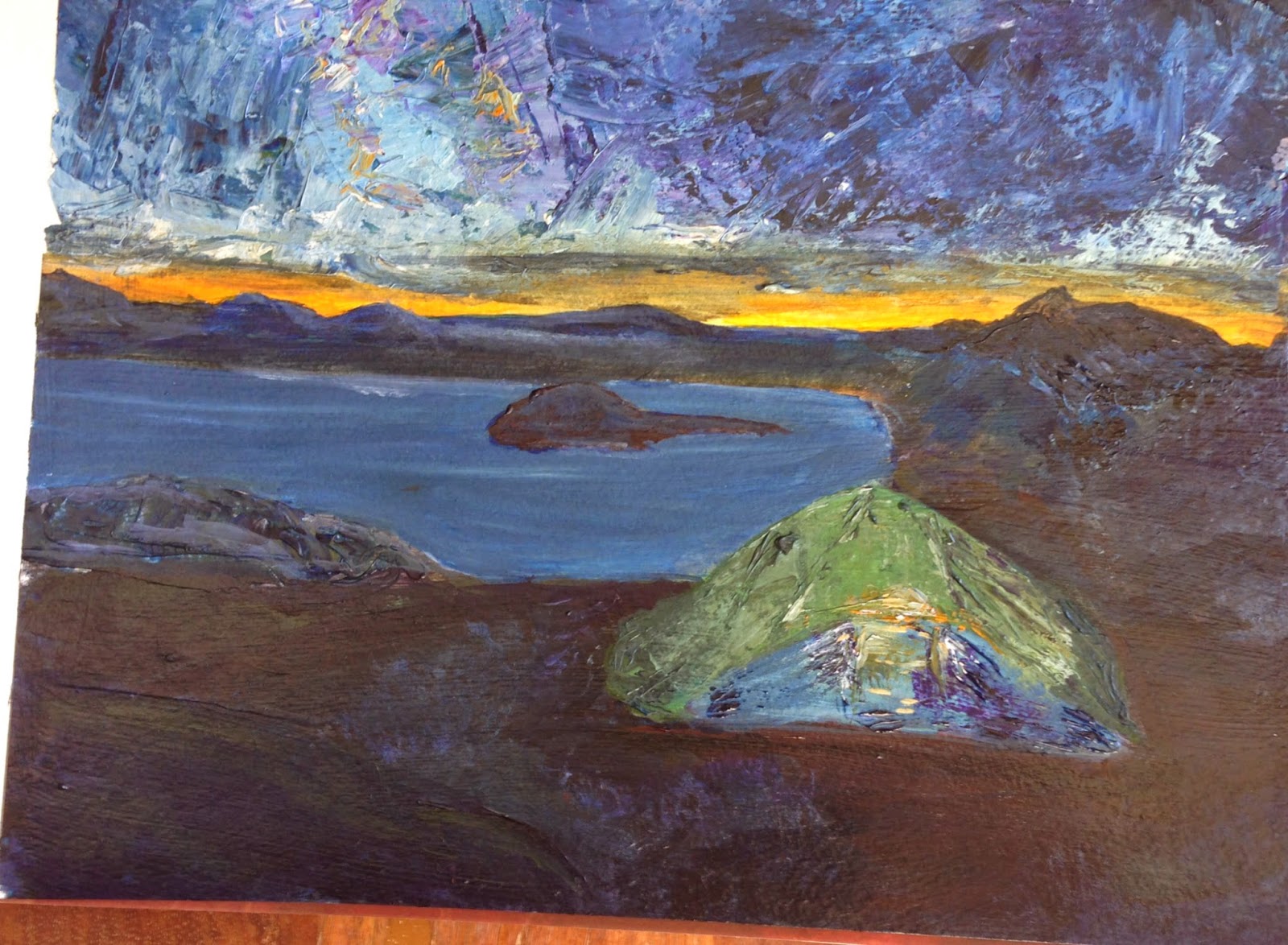
For class this week, I've decided to flip it. I picked a photo from Backpacker magazine that was a night scene. In this case, most of the ground was the darkest value. The sky was medium, and the tent and sunset was the lightest.
It is a pretty poor photograph because the darks are so dark, I needed a lot of light to take the picture.

I textured the sky and tent with a palette knife and some heavy gel medium. Now, I'm not done, but I haven't decided what to do next. I am not completely happy with the dark ground. (Maybe I'm getting texture-happy.)

Once I'm finished, I plan to flick some stars in the sky and some dirt on with a toothbrush.

FYI, before I began this painting I was searching for info on night scenes. Van Gogh painted a lot of night scenes. I found this great site that talks about the colors he used. So, although he was more yellow/blue, I went for a more classical orange/blue palette. The green is stretching the palette a bit, but it was a color I didn't want to give up, and I think it lends more interest than a blue tent might have.

Wednesday, October 29, 2014

With the Kids: Painting Complementary Colors

Most of the time my kids get to work on paper, but occasionally, they get to do a special project on canvas. (Read: VERY BIG deal for them)

On paper, if they totally disregard whatever it is that we are doing, I'm okay with that. But on canvas, I try to keep them a little more on task. A bunch of canvas that end up brownish-gray is not too fun.

One of the ways I try to keep them on task is to give them a limited color palette. In this case, we were working with blues and blues complement, orange. They had a choice to paint water and boats or water and orange fish. Both of my kids chose to paint boats (I guess they take after me). We did this project with a friend who painted fish, but I forgot to take a picture of his painting.

The other technique that the kids were starting to learn here was how to gradually change the color of the blue paint using white. You can see in my daughter's painting (5 yrs old) that the water lightened as it went down the canvas.

Tuesday, October 28, 2014

Back to the Beach

This week, I took a break from painting people and fabrics to go back to my love of landscapes of the water.

I used the technique of blocking in color with lights, mediums, and darks first. The darks (the sky & blue houses) are colored with a wash of crimson, green, and ultramarine blue. The mediums with just crimson and green. The lights are bright orange.

The bright orange is what is responsible for this really lovely sky. My peers came up to me as I was painting and told me to just "Stop". They loved the moody sky.


I also removed the stilts that the houses were sitting on and some people from the background. My teacher and I thought the stilts would complicate the picture and pull emphasis in where we didn't want it.

I also began, at home, a picture I want to put up on my wall. It is based on two pictures I found. One has a bike that looks like one I own, only it had flowers in the basic. Another had a bike that I didn't like but the water was in the background. Both are similar to a pillow I own, so I thought I'd make my own version.
As you can see, I have the darks of the sea and grass laid in. I also have the brights of the basket and tires. My next step will be working on sand and then the grassy-to-be-fenced area.

My husband saw this and didn't understand that this was just the beginning. He said that the bike should be a little brighter. :-)

Art with the Kids

My son told me that he doesn't like art at school because the teacher wants him to be clean and neat. He also said that she is only letting them use markers and crayons and not paint. I don't know if this stems from the mess or teachers having to buy their own supplies, but I wanted to give my son a chance to express himself with paint and mixed media. So, here are some of the projects that my kids 5 & 7 yrs old have been working on.

I followed the much-pinned tutorial for creating this flower & sun scene. A round sponge is used for the sun with yellow & white paint. A q-tip is used to create the flowers.


Over the summer, we went the the Dali museum in Florida. (http://www.tampabay.com/news/humaninterest/hair-raising-experience-at-the-dal237-museum/2189986)
So, in studying surrealist art, we did some collages, mainly set around Magritte's work. Putting things that don't belong together.


Friday, October 24, 2014

Painting Fabric

I've decided that I am most scared of painting people. I do not aspire to be a portrait artist, but I don't want to be afraid of painting them either. So, I've chosen some examples (you can see Pinterest gallery for them), and I am going to try to paint in that style.

After seeing an example, my teacher told me that I needed to spend some time painting fabric, the lights and the darks. How the light hits the fabric, and what happens in the folds and drapes. She asked me to try painting from life and to try painting from a photograph upside-down so that I see only shapes.

I'm pretty proud of the woman in the purple sari. And my daughter was upset that I painted her doll without her head.

Oh, and yes, I did feel the need to paint another pear!

The Pear

All over the Internet and on art sites, it is easy to see that painting the pear is a rite of passage. It was in the painting class I joined too. I spent 2 classes painting the pear and 2 weeks at home. I painted it in color. I painted it in black and white and glazed it.


And you can see that when I got tired of the pear, I started on lemons and apples.