Tuesday, January 13, 2015

Crossing a Boundary--My own Degas

I crossed a boundary recently. I finally produced something that surprised me at how well it turned out.

I love Popular Photography and Backpacker magazines. I found a lot of inspiration from these photos. A winning photograph in Popular Photography was of some ballet dancers waiting behind stage. The photographer altered the photos digitally to make it look more like a painting than a photograph- a bit Degas.

Although the photograph was one large spread, I decided that I liked the photograph split according to the pages of the magazine. I painted one of the blue ballerinas, and I’m working on another of the pink ballerinas.


I think what caught my attention was the dramatic lighting. I like the light falling on the dancers’ skins and the dark background. I also love the photograph for the dancers of different sizes.

Abstract Beach Scenes- Using Leftover Canvas

During the Winter Break, I found some Christmas canvas leftover from a project. My kids and I had made several Christmas themed sayings and trees last year, but they didn’t make it through the storage without incident. I decided not to hang them this year. I looked at these four square canvas and thought about using some gesso on them. Since we had used scrapbook paper on the Christmas crafts, I decided that I needed to add some more texture to them. Thus, it was time to experiment…

Here, you will see 3 square canvases. (Number 4 was a throw out. Awful color. Awful composition. It just didn’t work and ended up with papers sitting on it.)

The simple beach of 3 stripes was just experimenting with texture and color. A peer in my art class had used something similar as a background, but I wanted it to stand out.

The beach with orange fish is based on my love of scrapbook materials. I used water-look scrapbook paper, sandy-look pages, and the fish. The water and sand got painted over, but I let the fish stand out.

The third painting is based off something I saw on pinterest. I loved the ocean color and wanted to work on the composition.

Now, the fourth painting I pictured here (the rectangular one) is an abstraction of a picture I took in St. Petersburg. I liked the composition of boats, but the light did make for a very interesting water. I am hoping to add some sea glass to this picture as the sails.


My overall take is that underpainting in warmer coolers has significantly improved my abstractions. It makes them more interesting and cohesive.

Friday, December 19, 2014

Coloring Winter

I think I should be deemed a colorist, someone who wants to change and increase the colors of reality. That has been my mission during this holiday season--to experiment with color schemes. One interesting color scheme is the tertiary color scheme. The most standard of these is red, blue, yellow.

Let's consider this picture.
Now this one could go a couple of ways. It could be a analogous complimentary color scheme of red/orange/yellow and bluish-green. Or you could make it tertiary of red, yellow, blue with the street being bluish and the green being more bluish.

Winter scenes are common with the other tertiary color scheme: orange, purple, green. That is what I decided to try. I had noticed this triad in this Monet painting in St. Louis.


First, I started with the instructions for a painting from a book, with a similar color scheme.


Then, I chose a photo from my trip to Colorado, similar to this one.


The Aspens were bright yellow. The mountains were brown/gray with snow on top. But to make my color scheme work, the mountains became purple and the Aspens went slightly more orange. Now, yellow and purple could have worked as a color scheme too, but something else would have needed to happen with the green.


Friday, November 14, 2014

Seeing the Museum Differently

I took a week off from my class and my own painting to do some traveling. During my travel, I stopped off at St. Louis's Art Museum. (Best part--It's free!)

The art museum is more haphazardly laid out than any other I remember--although it might just be that I didn't understand the logic of it. In one room is impressionist, the neighboring one might have modern works, and the third will have art pieces of the Native Americans or artifacts of the Inca.

I whizzed by most of the modern art. Sorry! But I like abstract realism- is that the word? Where a real place or object is abstracted in form or color but you can tell what it is meant to be. Large pieces of artwork painting solid black or with lines just don't do it for me. I also flew through a special exhibit on Polynesia. It was pretty good because it had the meanings of the objects explained, but since I have never been and don't plan on going to Polynesia, I breezed by it. I wanted to see paintings!

When I saw this Monet painting, I suddenly understood the triadic color scheme of purple, green, orange. I had trouble understanding how to apply it before. Now, I would love to paint some other bridge with this lovely scheme.

I think the bright colors, especially blues and greens attracted me to this painting, but what made me stop and look at it for a while was the brushwork. I liked to see how all the different brushwork came together, the thing I struggle the most with now.
Take a look at the brushwork up close!
Also, it reminds us how realism and perfection don't always go hand-in-hand with good painting. Sometimes you just have to step away from the painting! (So often I hear us in class telling someone to stop, it looks great when the painter wants to keep going with it.)

This painting caught my eye for nothing technical but for subject. I have seen dark paintings of factories expressing the gloom, the depression. Instead, here the painting is pretty. It looks happy (probably more like an advertisement would want us to believe). Could it really have looked so idyllic? Or does it just show the painter's belief in industrialization?

Friday, October 31, 2014

Keep the Light...and the Dark

We have been working on value block-ins. The lightest values are painted in orange. The medium values are green/red mix, and the darkest have ultramarine blue mixed into that.

One of the homeworks that I assigned myself was this frog.
I used a picture from an advertisement in Popular Photography.
I blocked it in with the leaf near the frog's feet, his face, and his feet orange. The darkest hue was the almost black (actually a deep mix of ultramarine and the red-orange color).

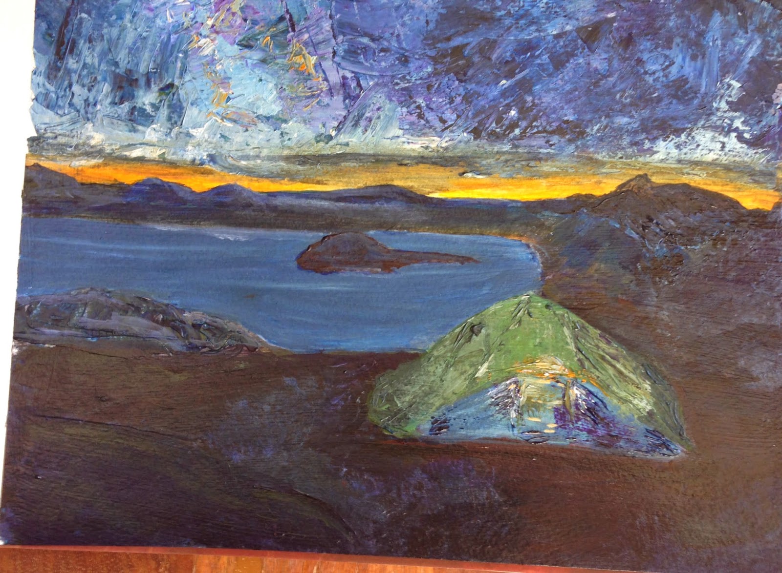
For class this week, I've decided to flip it. I picked a photo from Backpacker magazine that was a night scene. In this case, most of the ground was the darkest value. The sky was medium, and the tent and sunset was the lightest.
It is a pretty poor photograph because the darks are so dark, I needed a lot of light to take the picture.

I textured the sky and tent with a palette knife and some heavy gel medium. Now, I'm not done, but I haven't decided what to do next. I am not completely happy with the dark ground. (Maybe I'm getting texture-happy.)

Once I'm finished, I plan to flick some stars in the sky and some dirt on with a toothbrush.

FYI, before I began this painting I was searching for info on night scenes. Van Gogh painted a lot of night scenes. I found this great site that talks about the colors he used. So, although he was more yellow/blue, I went for a more classical orange/blue palette. The green is stretching the palette a bit, but it was a color I didn't want to give up, and I think it lends more interest than a blue tent might have.

Wednesday, October 29, 2014

With the Kids: Painting Complementary Colors

Most of the time my kids get to work on paper, but occasionally, they get to do a special project on canvas. (Read: VERY BIG deal for them)

On paper, if they totally disregard whatever it is that we are doing, I'm okay with that. But on canvas, I try to keep them a little more on task. A bunch of canvas that end up brownish-gray is not too fun.

One of the ways I try to keep them on task is to give them a limited color palette. In this case, we were working with blues and blues complement, orange. They had a choice to paint water and boats or water and orange fish. Both of my kids chose to paint boats (I guess they take after me). We did this project with a friend who painted fish, but I forgot to take a picture of his painting.

The other technique that the kids were starting to learn here was how to gradually change the color of the blue paint using white. You can see in my daughter's painting (5 yrs old) that the water lightened as it went down the canvas.

Tuesday, October 28, 2014

Back to the Beach

This week, I took a break from painting people and fabrics to go back to my love of landscapes of the water.

I used the technique of blocking in color with lights, mediums, and darks first. The darks (the sky & blue houses) are colored with a wash of crimson, green, and ultramarine blue. The mediums with just crimson and green. The lights are bright orange.

The bright orange is what is responsible for this really lovely sky. My peers came up to me as I was painting and told me to just "Stop". They loved the moody sky.


I also removed the stilts that the houses were sitting on and some people from the background. My teacher and I thought the stilts would complicate the picture and pull emphasis in where we didn't want it.

I also began, at home, a picture I want to put up on my wall. It is based on two pictures I found. One has a bike that looks like one I own, only it had flowers in the basic. Another had a bike that I didn't like but the water was in the background. Both are similar to a pillow I own, so I thought I'd make my own version.
As you can see, I have the darks of the sea and grass laid in. I also have the brights of the basket and tires. My next step will be working on sand and then the grassy-to-be-fenced area.

My husband saw this and didn't understand that this was just the beginning. He said that the bike should be a little brighter. :-)